
Offseason Finance
Strategy, Design, Execution
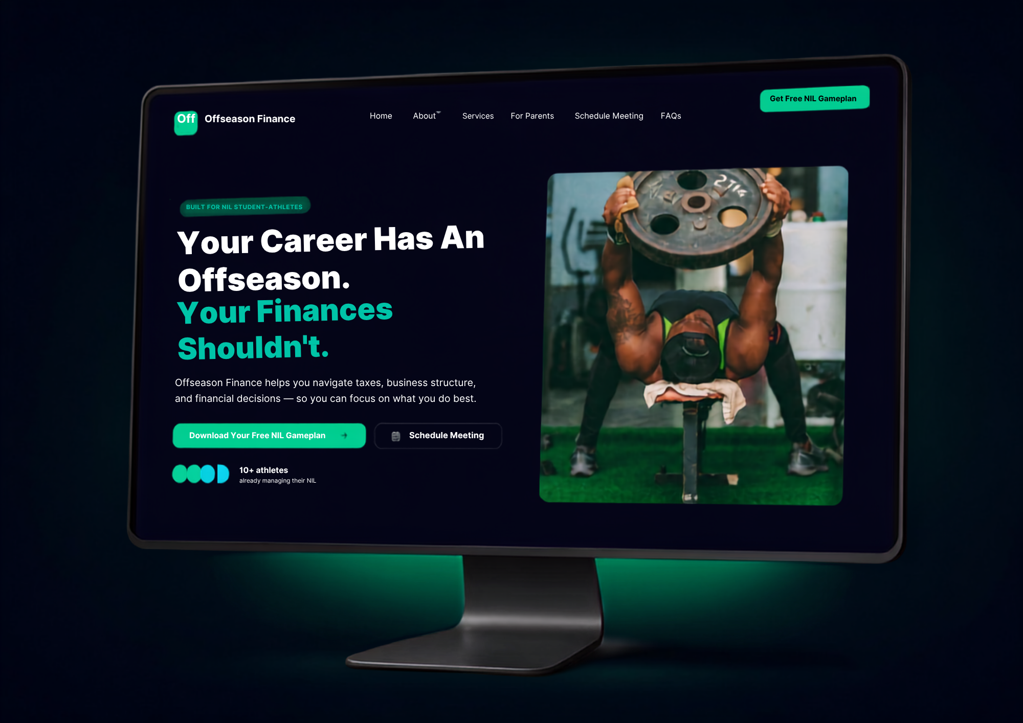
Offseason Finance needed a digital experience that could make a complicated subject—NIL finances—feel simple, approachable, and actionable.
Rather than building a traditional financial advisory website, I designed a focused landing page around one primary objective:
Educate the athlete. Build trust. Capture the lead.
The experience introduces the problem, establishes Offseason Finance as a trusted resource, communicates the value of professional guidance, and drives visitors toward a free NIL Process Guide.
The result: a focused, conversion-driven landing page designed to turn information-seeking student-athletes and their families into qualified conversations.
NIL creates opportunity—but it also creates a new set of financial responsibilities for student-athletes and their families.
Taxes.
Business structure.
1099 income.
LLCs.
Long-term planning.
For someone entering the NIL world for the first time, that can quickly become overwhelming. The challenge was to communicate the value of financial guidance without making the website feel like a traditional financial services firm.
The website was built around a simple problem/solution framework:
You have NIL opportunities.
Now you need a plan.
Instead of asking visitors to immediately commit to financial advisory services, the site offers something with immediate value: a free NIL Process Guide. That creates a lower-friction entry point into the Offseason Finance ecosystem.
The journey becomes:
Identify the problem → Understand the opportunity → Build trust → Get value → Start the conversation.
The visual system was designed to sit at the intersection of finance and sports. Professional enough to establish trust. Athletic-minded enough to connect with the audience. Modern enough to feel relevant to the next generation of athletes. Strong typography, athlete-focused imagery, structured information, and clear CTA hierarchy create an experience that feels more like a modern sports brand than a traditional financial advisor.
The page was intentionally designed around the CTA. Rather than burying the next step at the bottom of the page, strategic calls-to-action are introduced throughout the experience. The free NIL Process Guide functions as the primary lead magnet and gives the visitor a reason to engage before making a larger commitment. The design therefore treats the CTA as part of the user experience—not an afterthought.
The website connects the content experience directly to lead capture. The visitor receives a valuable resource. Offseason Finance receives contact information. The relationship begins before the sales conversation. This creates a scalable acquisition model where the website isn't simply explaining the business—it is actively helping build the pipeline for additional marketing efforts and relationship nurturing.
The finished landing page gives Offseason Finance a digital experience designed around its most valuable audience: NIL student-athletes and their families. It turns a complicated financial conversation into a simple first step.
Learn.
Plan.
Protect.
Build.
The website's job isn't to convince someone to become a client in one click.
It's to give them enough value and confidence to take the next step.
Developed the page around a single conversion objective rather than treating it as a traditional informational website.
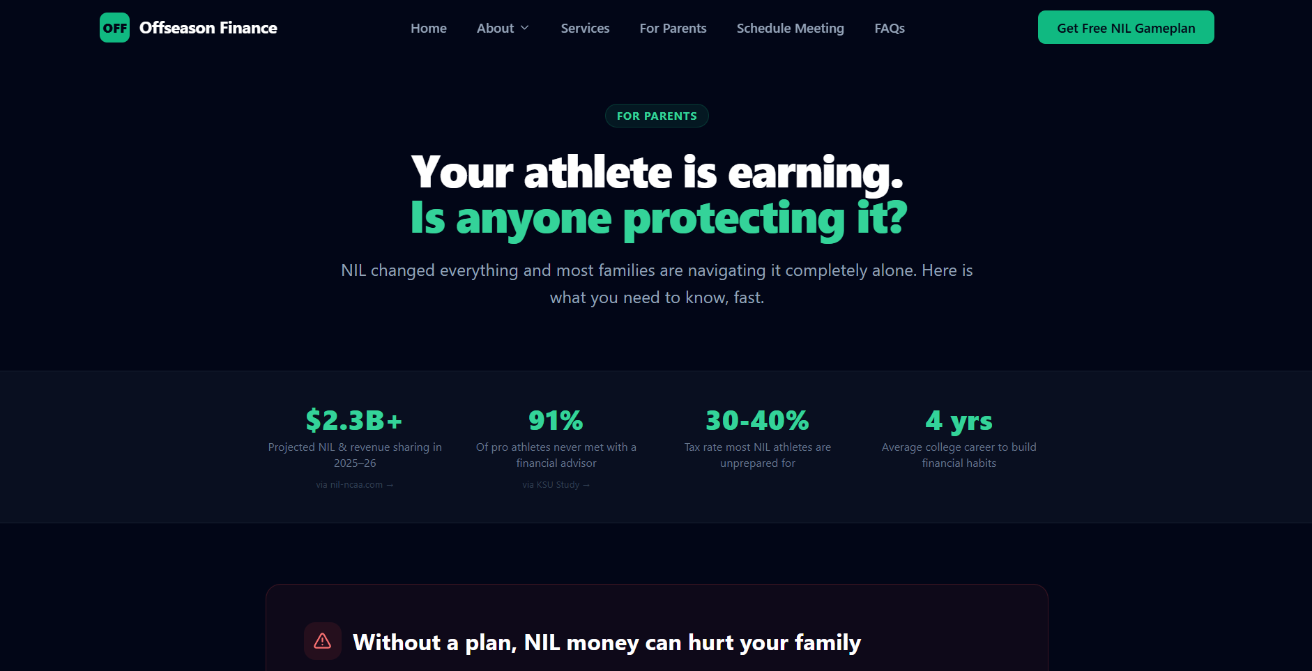
Structured messaging around NIL student-athletes and their families, focusing on their financial concerns, questions, and need for trustworthy guidance.
Designed the user journey around education, trust, value exchange, and lead capture.
Positioned the NIL Process Guide as a high-value entry point designed to reduce friction and generate qualified leads.
Translated complex financial concepts into clear, accessible messaging that speaks directly to athletes and families.
Developed a hierarchy of calls-to-action that repeatedly gives visitors a clear reason to engage.
Designed the lead-capture experience to support the transition from website visitor to qualified prospect.
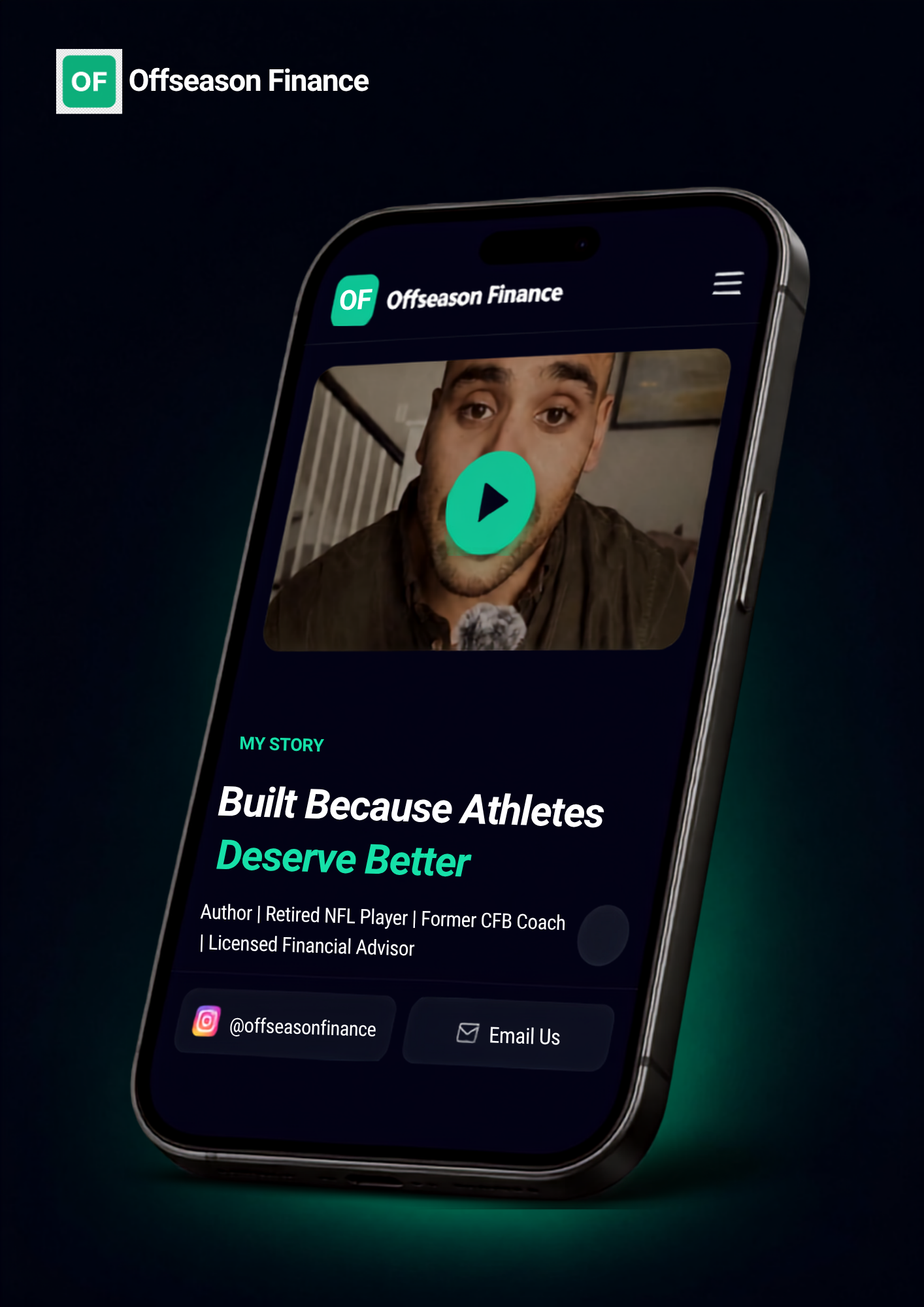
Created a responsive experience that maintains the same conversion priorities across desktop and mobile.
Focused the page structure, content hierarchy, and interactions around reducing friction and keeping the visitor moving toward the next action.

.png)

(NEE-YA-MYA)
Beautiful design has the power to captivate audiences.